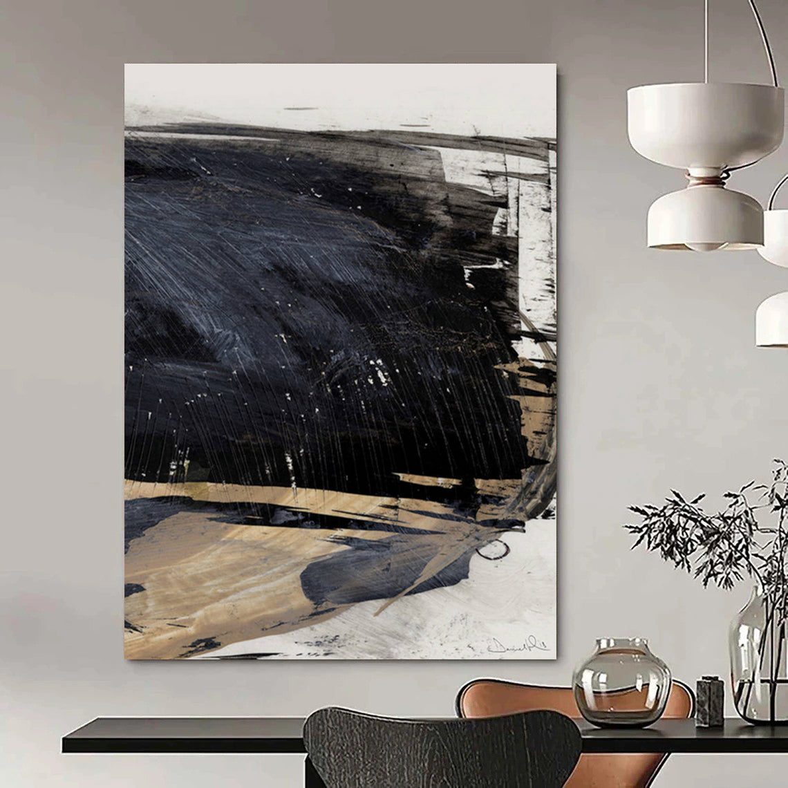

In a world of constant digital noise and urban intensity, the quiet pull of the coast remains one of the most restorative forces available to the modern mind. Soft gradients of teal meeting white foam, the measured rhythm of waves, the quiet transition from deep water to pale sky—these elements have long inspired artists seeking to translate atmosphere into form. The painting under consideration embodies precisely this spirit. Thick, directional brushstrokes of deep teal and indigo sweep across the upper registers, breaking into lighter, more diffused whites and soft gray-greens that settle into sandy, muted tones near the lower edge. The surface carries visible texture: ridges of impasto catch light differently depending on the time of day, giving the work a living quality that changes with ambient illumination. It is neither a literal seascape nor a pure geometric exercise; it occupies the fertile middle ground of abstraction where memory of place and pure sensation meet.
This is the visual language of the Textured Blue - Green Abstract Painting for Coastal - Inspired Home Offices HENG176. Designed for spaces that balance productivity with calm, the piece offers both aesthetic presence and psychological respite. In a home office, where long hours at a screen can flatten the senses, such a work functions as a quiet counterpoint—an invitation to pause and breathe.

Reading the Surface
The composition is organized in broad horizontal bands that suggest, without insisting upon, a horizon line. Upper layers of saturated teal and darker blue create a sense of depth and atmospheric weight, while the middle and lower sections lighten into creamy whites, pale aquas, and soft beige. Occasional flecks of warmer tone appear like distant sunlight glancing off water. The brushwork is gestural yet controlled: long, sweeping strokes alternate with shorter, more broken marks that evoke the irregular energy of moving water. Texture is not incidental. Raised paint creates subtle shadows and highlights, so that the painting rewards both distant viewing and close inspection. From across a room it reads as a serene coastal field; up close it reveals the physical record of the artist’s hand.
This approach sits comfortably within the broader history of abstract art, which, as Britannica notes, prioritizes form, color, line, tone, and texture over the accurate depiction of the visible world. Artists working in this tradition have long understood that the omission of literal detail can intensify emotional and sensory response. The present painting participates in that tradition while remaining firmly rooted in the sensory memory of coastal landscapes.
The Artist’s Journey and Creative Philosophy
Sophia Langley, the contemporary artist associated with this body of work, developed her practice through years of direct observation along the Atlantic and Pacific coasts. Born in a small coastal town, she spent childhood summers studying the way light fractured on water and the way storms rearranged the shoreline overnight. Formal training in fine arts introduced her to the rigorous formal concerns of modern abstraction—particularly the legacy of color-field painting and gestural mark-making—but she never fully abandoned the landscape as a source. Instead of rendering cliffs or boats, she began distilling the atmospheric conditions of the shore into layered color and tactile surface.
Her creative philosophy centers on the idea that abstraction can be more truthful than representation when the subject is sensation rather than object. “I am not interested in painting a specific beach,” she has said in studio notes, “but in capturing the feeling of standing at the edge of something larger than myself—the weight of air, the pull of tide, the quiet after the wave retreats.” This conviction led her to thick acrylic and mixed-media techniques that allow paint to retain its physical presence. Texture becomes a stand-in for the grit of sand and the resistance of water. Color is calibrated not for local accuracy but for emotional resonance: cool blues and greens for contemplative depth, lighter tones for release and openness.
Langley’s development mirrors a larger trajectory in twentieth-century art. After early experiments with more figurative coastal scenes, she moved toward greater simplification, influenced by the way postwar abstract painters used color and gesture to evoke psychological states. She studied the expansive fields of Mark Rothko and the energetic surfaces of Abstract Expressionism, absorbing lessons about scale, surface, and the viewer’s bodily relationship to the canvas. Yet her work remains distinctively tied to place. Where pure geometric abstraction might eliminate reference entirely, Langley’s paintings retain a soft memory of landscape—enough to orient the viewer without dictating a narrative.
Over the past decade she has refined a consistent method: beginning with thin washes that establish overall temperature, then building successive layers of thicker paint applied with both brushes and palette knives. The final surface is often left with visible ridges and occasional small interruptions of pure pigment, allowing light to play across the work throughout the day. This process demands patience; a single large canvas may occupy the studio for several weeks as layers dry and subsequent decisions are made in response to the emerging surface.

Abstraction and the Coastal Interior
The appeal of works like this extends beyond personal taste into the practical realities of contemporary interior design. Home offices, once secondary spaces, have become primary environments for many professionals. Designers increasingly recognize that visual calm supports sustained attention. Blue and green hues have long been associated with reduced physiological arousal and improved focus; when those hues are organized abstractly rather than literally, they avoid the potential distraction of recognizable imagery while still delivering the restorative associations of water and sky.
In this context, a Blue Abstract Painting such as HENG176 functions as more than decoration. It becomes an environmental tool. Hung above a desk or on the wall opposite a workstation, it offers a soft focal point during moments of mental fatigue. The textured surface adds a subtle dimension of tactility that counters the flatness of screens. Clients who work in tech, writing, design, and consulting have reported that the painting creates a psychological boundary between the intensity of work and the possibility of rest—even when the office is only a few steps from the rest of the home.
Art institutions have long documented the capacity of abstract work to engage viewers on an emotional rather than narrative level. The Tate’s definition of abstract art emphasizes the use of shape, color, form, and gestural marks to achieve effects independent of accurate depiction. Similarly, discussions of Abstract Expressionism at the Metropolitan Museum of Art highlight how large-scale color and gesture can produce a sense of the sublime or the contemplative. Langley’s coastal abstractions participate in that lineage while remaining accessible and domestic in scale and palette.
Voices from Owners
Natural responses from people who live with the work reveal its practical and emotional range. Emily Carter, a freelance graphic designer in Portland, wrote after several months: “I put the blue-green piece directly across from my standing desk. On long deadline days it keeps me from feeling trapped indoors. The texture is more interesting than I expected—light from the window hits the ridges differently in the morning versus late afternoon. It feels like a small window to the coast even though I’m miles inland.”
Michael Torres, who works in software from a converted guest room in Austin, noted the painting’s effect on clients during video calls: “People comment on it almost every time. It softens the background without looking staged. More importantly, it makes the room feel less like a converted bedroom and more like a deliberate workspace. The colors are calming without being sleepy.”
Another owner, Sarah Nguyen, a therapist who maintains a home office for private sessions, observed: “Clients often glance at it during pauses. It doesn’t demand attention the way a figurative landscape might, but it seems to give people permission to settle. I chose it because the blues and soft greens felt clinical in the best sense—clean, open, and non-intrusive.”
These accounts align with broader observations about the role of carefully chosen abstract work in residential professional spaces. The painting does not dominate; it supports.

Living with Texture and Color
Practical considerations matter. The canvas is gallery-wrapped, ready to hang, and the textured surface benefits from directional lighting that emphasizes the impasto without creating glare. In rooms with cooler northern light the blues deepen; in warmer southern exposures the lighter bands become more luminous. Because the composition is balanced rather than aggressively directional, it works equally well in horizontal or slightly elevated placements above furniture.
Collectors drawn to coastal-inspired interiors often find that a single strong abstract piece can unify a room more effectively than multiple smaller representational works. The absence of literal subject matter allows the painting to coexist with furniture of various styles—mid-century, Scandinavian, contemporary coastal—without stylistic conflict. It reads as modern yet organic, precise yet handmade.
FAQ
What makes this painting suitable for a home office?
Its cool blue-green palette and open composition promote visual calm without narrative distraction. The textured surface adds quiet visual interest that rewards occasional glances during long work sessions.
Is the texture three-dimensional?
Yes. The painting employs layered impasto techniques that create raised ridges and varied surface depth. These catch light and change appearance throughout the day.
How does it relate to traditional coastal art?
It belongs to the tradition of abstract responses to landscape rather than topographical depiction. Like earlier abstract artists who distilled nature into color and gesture, it prioritizes atmosphere and sensation over identifiable landmarks.
What size works best?
Larger formats tend to create a stronger environmental presence in an office, functioning almost as a secondary window. Smaller sizes can serve as complementary accents near bookshelves or secondary walls.
Does the painting require special lighting?
Natural light or soft directional artificial light enhances the texture. Avoid harsh overhead spots that create unwanted glare on the raised paint.
Can it work outside a strictly coastal décor scheme?
Absolutely. The restrained palette and abstract language allow it to integrate into modern, minimalist, Scandinavian, and even industrial interiors that seek a note of organic calm.
In the end, the value of a work like the Textured Blue-Green Abstract Painting lies in its ability to hold two realities at once: the physical presence of paint on canvas and the remembered sensation of standing before an open horizon. For those who spend their days in rooms designed for productivity, that dual presence offers a quiet, reliable form of restoration—one brushstroke at a time.