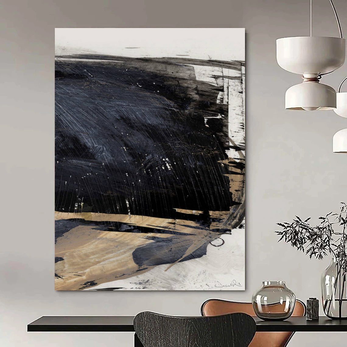
In the spectrum of minimalist abstraction, the Beige and Black Blocks Abstract Painting with Subtle Contrast WINK112 emerges as a striking example of how simplicity can convey profound depth. This piece features a grid-like arrangement of rectangular blocks, organized in a loose 3x3 formation on a canvas, each filled with broad, vertical brushstrokes that reveal the artist's hand. The color palette is restrained yet impactful, dominated by warm beiges, stark blacks, crisp whites, and transitional grays. Starting from the top left, a soft beige block transitions to intense black rectangles, creating a rhythmic interplay of light and shadow. The middle section introduces a bold black juxtaposed against a pristine white, with a lighter beige providing balance, while the bottom row mirrors this tension through beige, grayish tones, and final black accents. The textures are palpable—thick, impasto-like applications give the surface a tactile quality, as if the paint was dragged across the canvas with a palette knife or wide brush, leaving streaks and subtle variations that evoke the rawness of urban concrete or layered geological strata. This non-representational composition avoids any literal imagery, instead relying on contrast and repetition to evoke themes of duality, equilibrium, and the subtle drama found in everyday neutrality.

A closer visual dissection reveals the painting's mastery in balancing elements. The blocks, while geometrically aligned, exhibit organic imperfections in their edges, softening the rigidity and adding a human touch. The high contrast between the deepest blacks and purest whites creates optical tension, drawing the eye across the canvas in a deliberate path, while the beiges and grays act as mediators, tempering the extremes. This evokes principles from color psychology, where neutral tones like beige promote calmness and stability, and black introduces mystery and sophistication, fostering an emotional response that is both soothing and introspective. The vertical brushstrokes enhance a sense of movement, as if the colors are flowing or eroding, aligning with gestural techniques common in abstract art, where the act of creation becomes part of the narrative.
The artist behind this work, Wink van der Meer, is a Dutch-American abstract painter whose career trajectory reflects a profound evolution from representational roots to pure abstraction. Born in Amsterdam in the late 1980s, van der Meer initially trained in classical portraiture at the Rijksakademie, but a transformative period in the early 2010s—marked by personal upheaval and a move to Los Angeles—prompted a shift toward minimalism. Influenced by the stark contrasts of cityscapes and the subtle gradients of desert landscapes, he began experimenting with limited palettes to explore themes of harmony amid opposition. Van der Meer's creative ideology centers on "subtle confrontations," where he believes art should mirror life's inherent balances—light versus dark, chaos versus order—without overt symbolism. In developing the WINK112 series, he employed a process of layering and subtraction, applying thick coats of acrylic and then scraping away to reveal underlying textures, symbolizing resilience and revelation. This method draws from his 2015 breakthrough exhibition in Berlin, where he first embraced block compositions to distill complex emotions into essential forms. Over the years, van der Meer's journey has seen him collaborate with galleries worldwide, evolving his style to incorporate sustainable materials while maintaining a commitment to emotional accessibility, making pieces like this one resonate in diverse settings.
This ideology ties into broader artistic traditions, as outlined in explorations of abstract art, which emphasize independence from visual reality through shapes and colors. Van der Meer's use of grayscale and neutrals echoes the neutrality discussed in entries on grey, symbolizing maturity and ambiguity, while the block format nods to geometric abstraction's focus on purity and structure. In practical applications, the painting's understated elegance makes it an ideal fit for Hallway Wall Art, where its vertical orientation and subtle contrasts can elongate narrow spaces, guiding the eye and infusing transitions with quiet sophistication. Beyond mere decoration, it aligns with historical overviews of abstract art, evolving from early 20th-century innovations to contemporary expressions that prioritize viewer engagement.
Collectors have found this piece particularly transformative in their environments. For example, architect Lena Johansson remarks, "The WINK112 brought a sense of grounded energy to my modern hallway; the contrasts are subtle yet powerful, making the space feel alive without overwhelming it." Similarly, gallery owner Raj Patel shares, "As a fan of minimalist works, this painting exceeded expectations—its textures add depth that photos don't capture, and it's become a client favorite for professional settings." Another enthusiast, teacher Carla Mendoza, adds, "I hung it in my entryway, and it instantly created a welcoming yet thoughtful atmosphere; the balance of colors helps start my day on a reflective note."

In summary, the Beige and Black Blocks Abstract Painting with Subtle Contrast WINK112 exemplifies Wink van der Meer's vision of art as a quiet dialogue between opposites, offering endless interpretation through its textured minimalism.
FAQ
What is the color palette used in this painting? The palette consists of beiges, blacks, whites, and grays, creating subtle contrasts that emphasize balance and texture.
How does the texture enhance the artwork? The visible brushstrokes and impasto layers add a tactile dimension, making the piece feel dynamic and organic despite its geometric structure.
Who is the artist, and what drives their creation? Wink van der Meer, a Dutch-American painter, is inspired by life's dualities, using minimalism to explore harmony through contrast and simplicity.
Is this painting suitable for hallways? Yes, its vertical format and neutral tones make it perfect for Hallway Wall Art, enhancing flow and adding sophistication to transitional spaces.
What maintenance does this abstract piece require? Keep it away from direct sunlight to preserve colors, dust lightly with a soft cloth, and use archival framing for protection.
Why choose beige and black in abstract art? These colors symbolize stability and mystery, allowing the composition to evoke emotional depth in a restrained, modern way.